Project H.O.O.D Branding
Project H.O.O.D., provides mentorship, training, and community for residents of Woodlawn and Englewood.
BFF worked with Project Hood in a two phase project for rebranding. We paired PH with Chicago design firm, Firebelly.
Phase I: To help clarify PH’s brand strategy, by identifying what makes them unique and how to tell their story.
Phase II: To create a visual identity that best illustrates their brand identity.
What we did:
Brand Strategy
Creative Direction
Visual Design
Implementation
After Phase I and II, we realized that Project H.O.O.D. was struggling to find a staff member to implement the design across all their platforms. We were willing to pay that staff member to get trained in Adobe Illustrator and Canva. However, this staff member was already burdened with their own work. We decided we needed to help PH find a freelance designer instead and relieve the staff of this work. We interviewed a couple graphic designers and then handed the introductions off to PH. They chose the designer that best fit their culture. We provided a stipend for this additional work.

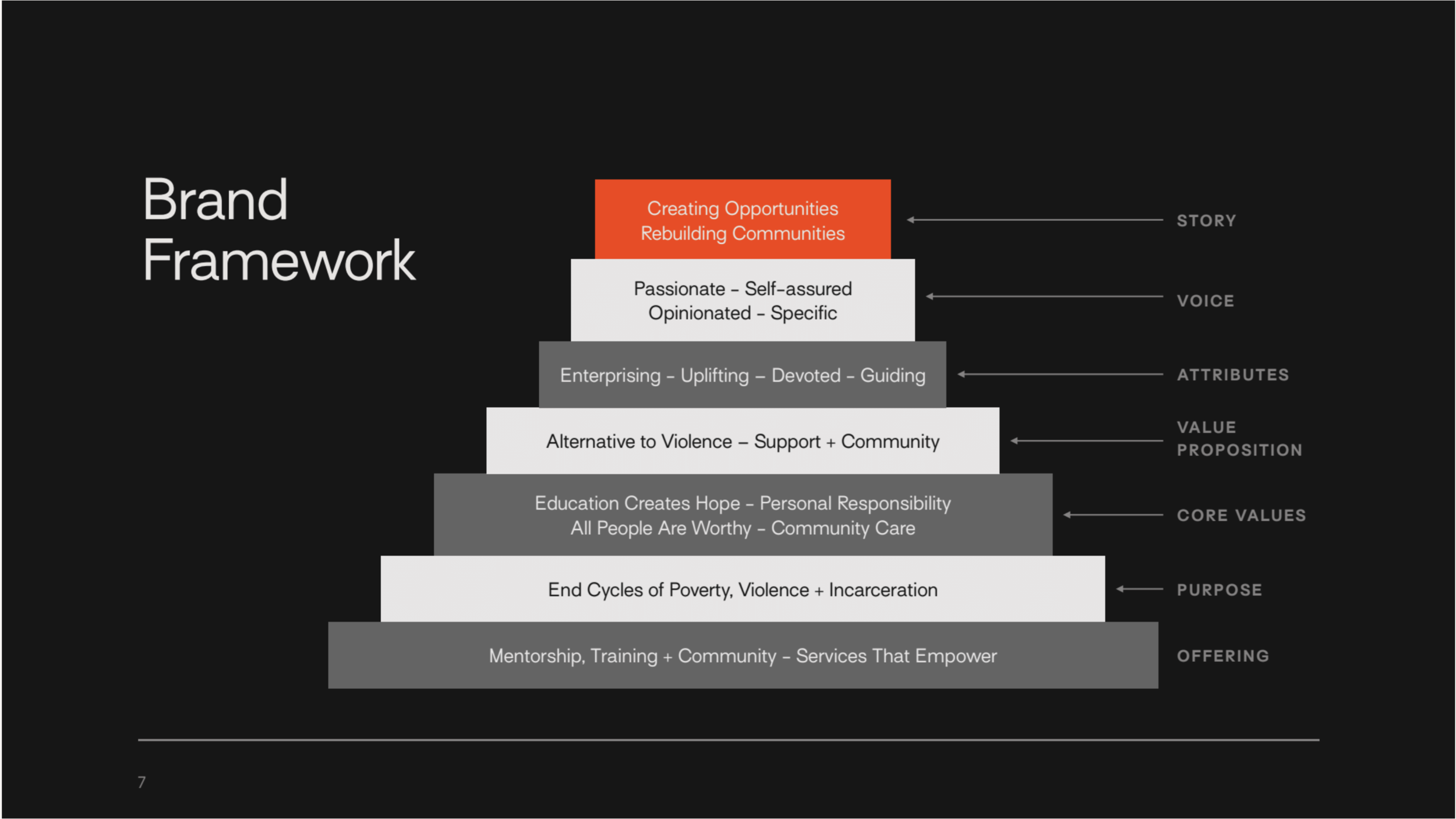
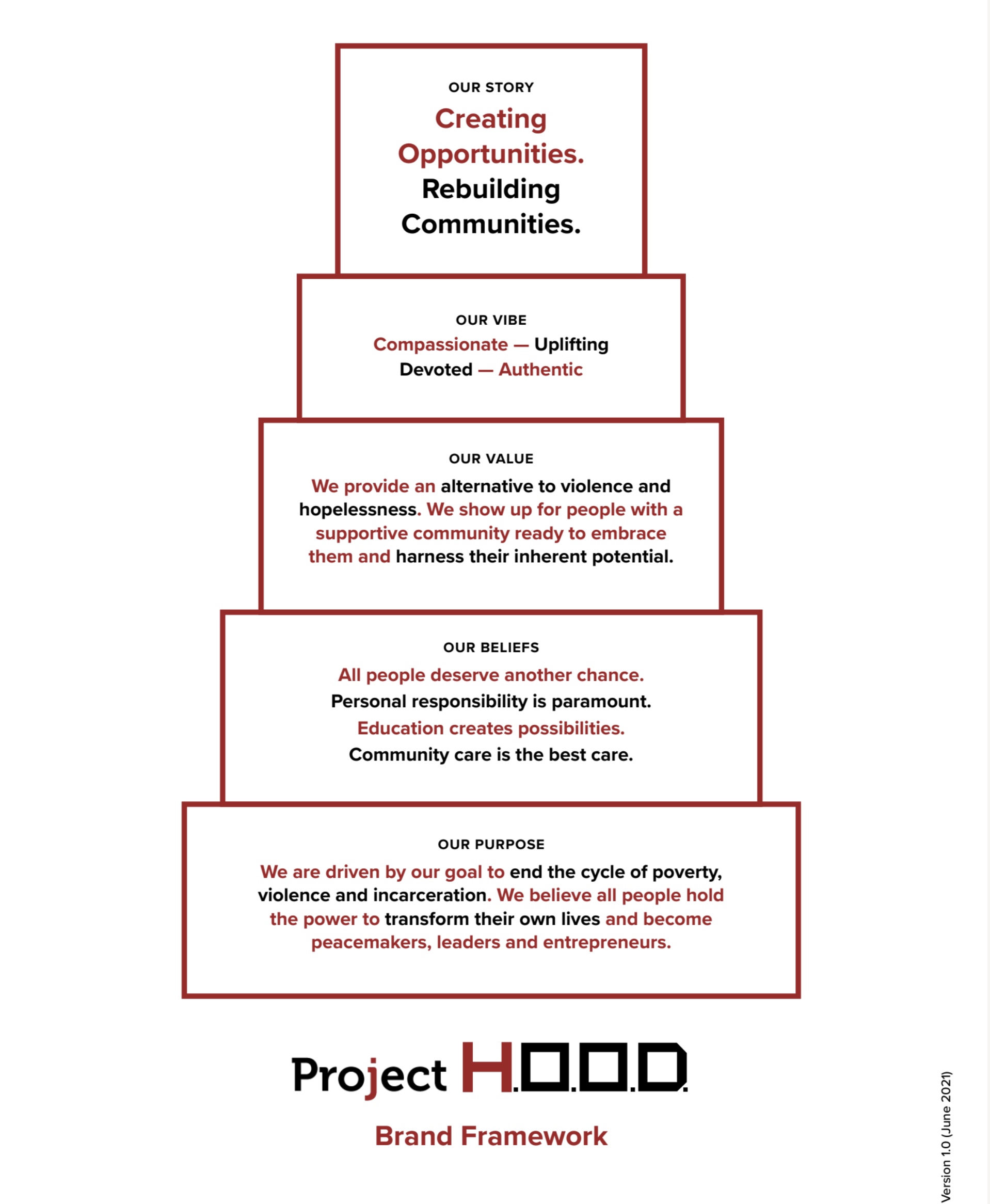
The Brand Framework came out of meetings with the PH crew. It lays out key words, PH's mission and what they do. They use this in all aspects of their communications now.

Firebelly helped PH see that they had 4 different audiences that they were addressing.

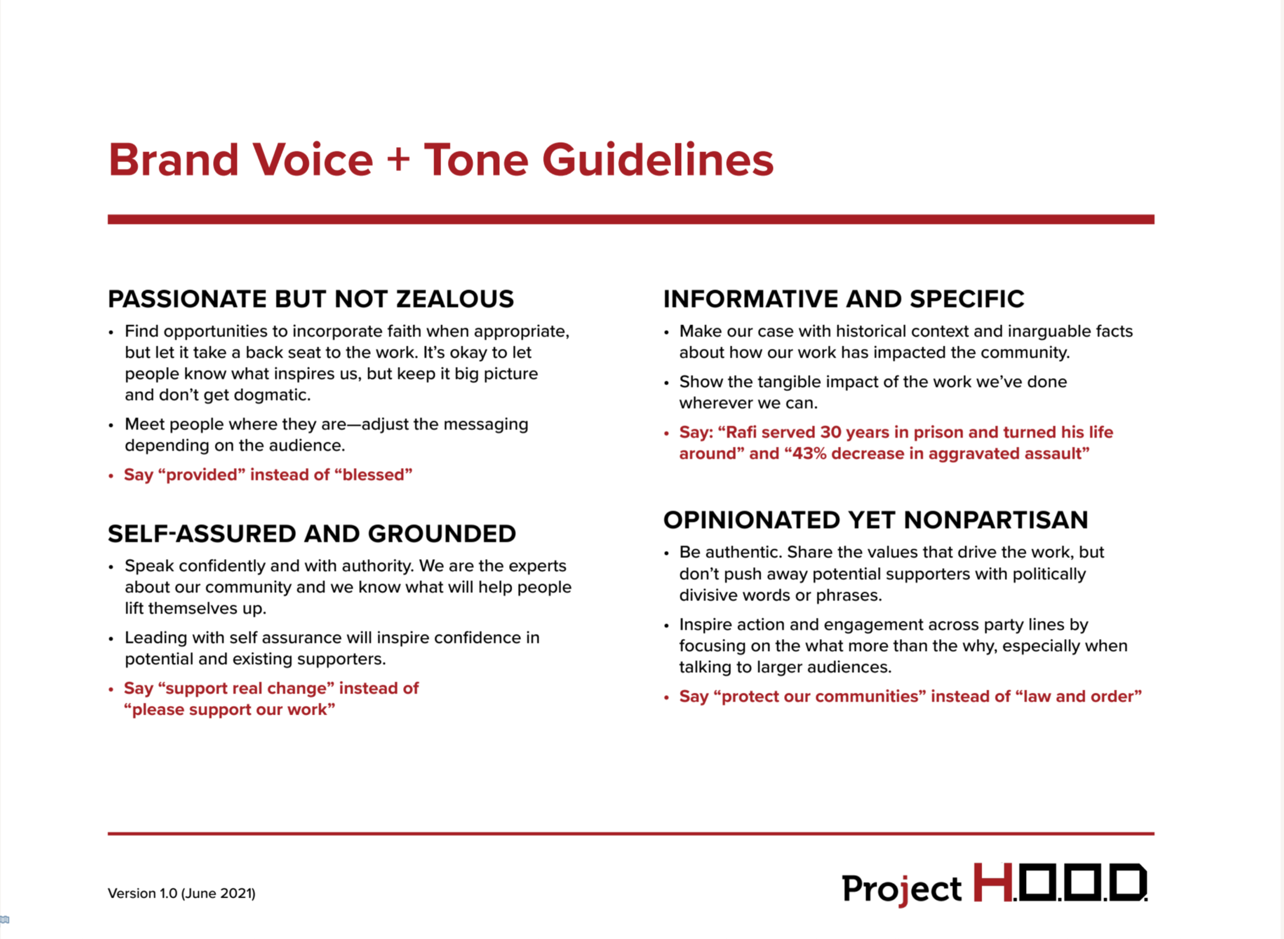
Tone

Mission statements

This was the first go around for design: there were 4 different logo options presented. They were shown on various digital and print applications.

The final logo was chosen from the 4.

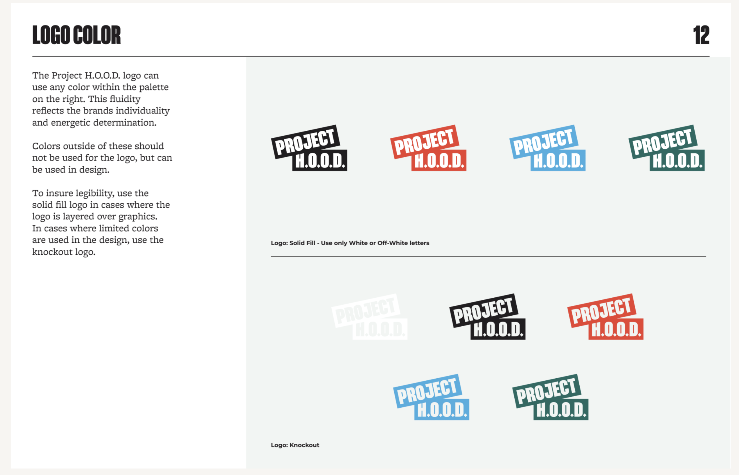
Ways to use the logos- knockout or solid fill.

These are the final color combinations of the logo.


How to use the slogan and business card.

The color combinations laid out even more excplicitly.

Swatches


Letterhead and business card designs.


Merchandise design.

Merchandise design.

Instagram templates.
